Neural Net Mapping of Hudson Bay Sea Ice
The Canadian Ice Service produces weekly regional sea ice charts for ship safety and environmental monitoring. In this project I use a convolutional neural network to automatically generate ice charts from satellite imagery. With increasing availability of satellite data, this network may be able to produce similar ice charts globally at higher detail. You can try out the model for yourself on this prototype web application.
Project Summary
- Collected 3392 satellite images of Hudson Bay sea ice in the Canadian Arctic from 2016-1-1 to 2018-7-31
- Generated sea ice concentrations masks for each image using Canadian Regional Ice Chart shapefiles
- Trained a Convolutional Neural Network (U-Net) to generate sea ice charts from satellite images based on eight different classes (seven levels of ice concentration and land)
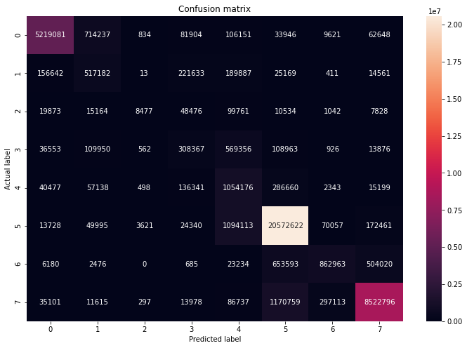
- Model Accuracy: 83%
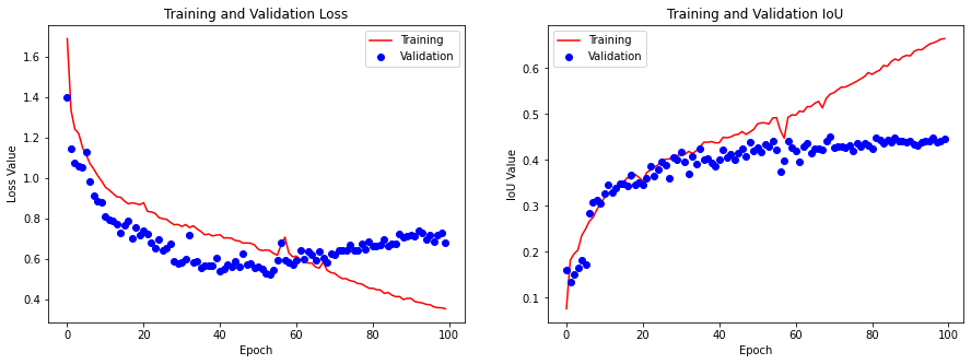
- Model Mean IoU (intersection over union) score: 0.44
- Found a strong class imbalance favoring thick solid ice due to complete freezing in the winter months. Future work should focus on collecting more data during the spring months when ice is thawing and there is a greater variety in ice concentration.
- Future work could also take advantage of additional satellite wavelength collection bands beyond the visible spectrum.
- The dataset is here: https://www.kaggle.com/alexandersylvester/arctic-sea-ice-image-masking
- The github repo is here: https://github.com/asylve/Sea-Ice
Code/Resources
Python Version: 3.7.10
Libraries Used: eolearn, sentinelhub, numpy, pandas, matplotlib, geopandas, sklearn, tensorflow, keras
Ice Chart Masks: Canadian Ice Service, . 2009. Canadian Ice Service Arctic Regional Sea Ice Charts in SIGRID-3 Format, Version 1. Subset: Hudson Bay Regional Ice Charts. Boulder, Colorado USA. NSIDC: National Snow and Ice Data Center. doi: https://doi.org/10.7265/N51V5BW9. Date Accessed: March 27, 2021.
Satellite Imagery: Modified Copernicus Sentinel data 2021/Sentinel Hub
EO-Learn Satellite Image Collection and Cleaning: https://eo-learn.readthedocs.io/en/latest/examples/land-cover-map/SI_LULC_pipeline.html
1. Data Collection
There are two main data sources for this project: Sentinel-2 satellite images and Canadian Regional Ice Charts. These were used to generate images and masks, respectively.
1.1 Sentinel-2
The Sentinel-2 mission is made up of a pair of satellites that image the globe roughly every 5 days. They capture 12 optical bands including the visible spectrum. Bands 3, 4, and 8 were used for this project, representing near infra-red, red and green wavelengths. Sentinelhub provides a python API for acquiring Sentinel-2 images.
1.2 Canadian Regional Ice Charts
Canadian Regional Ice Charts show geospatial sea ice concentrations for ship safety and environmental monitoring. They are produced weekly on Mondays by the Canadian Ice Service for five large regions:
- Hudson Bay
- Western Arctic
- Eastern Arctic
- Eastern Coast
- Great Lakes
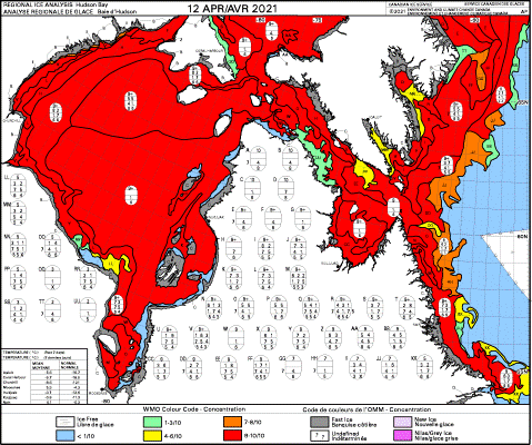
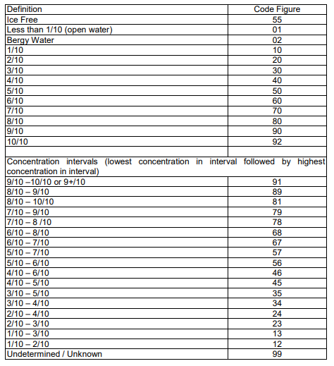
This project investigated the Hudson Bay region. A sample ice chart for Hudson Bay on April 12, 2021 is shown below. Each region on the chart has a corresponding set of codes giving information on (among other things) the concentration of sea ice. The table below shows the codes corresponding to ice concentration (source). All charts are archived and available as shapefiles from the National Snow and Ice Data Centre dating back to 2006.
 |
 |
|---|---|
| Sample Ice Chart for Hudson Bay | SIGRID-3 Ice Chart Codes |
1.3 Data Collection Workflow
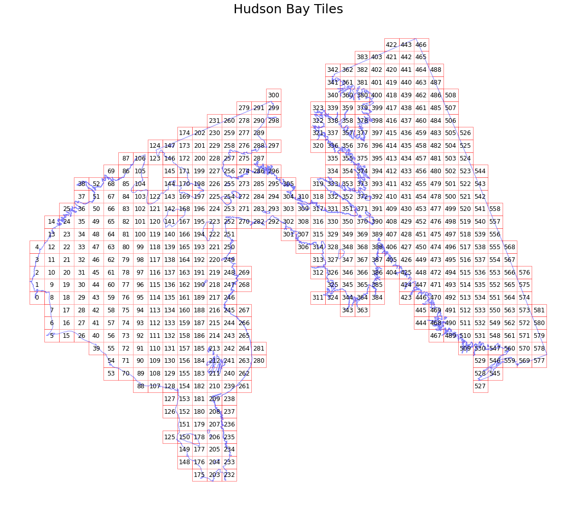
Data was collected using the EO-Learn python library, which provides a framework for slicing large geographical areas into smaller, more manageable tiles called EOPatches.
 |
|---|
| Sliced hudson bay region. Image/mask pairs are generated on each tile. |
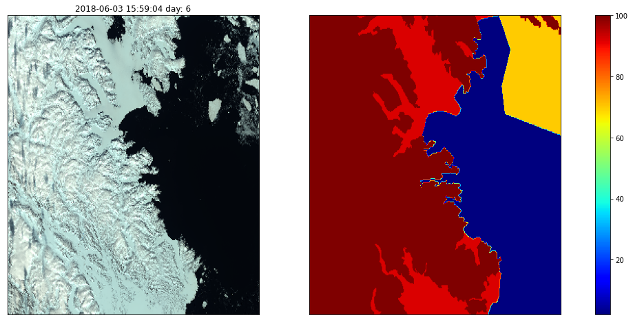
After slicing the region, an EO-Learn workflow was developed to aquire satellite images through the Sentinelhub API. The workflow includes filtering steps to remove cloudy images and a custom step to add a time-dependent image mask (from ice chart chapefiles). The data collection workflow loops over each EOPatch and consists of:
- add_data: Collect all available satellite images for the EOPatch in false color (bands B03, B04, and B08)
- remove_dates: Discard images that were taken more than 36 hours away from an available ice chart
- add_valid_mask: Collect a mask for each image that says which pixels are valid data
- add_coverage: Collect a mask for each image that says which pixels are blocked by clouds
- remove_cloudy_scenes: Remove images where the sum of cloudy and non-valid pixels is greater than 5%
- time_raster: Custom task to locate the ice chart temporally closest to the image, locate the area of the chart associated with the image, and rasterize into an ice concentration mask for the image
- save_im: Save each image and mask
 |
|---|
| Image and mask pair generated through the EO-Learn workflow |
2 Data Processing
2.1 Class Definitions
In order to simplify analysis, the 31 SIGRID-3 classes shown in section 1.2 were binned into 8 classes broadly defined as:
- 0: <10% ice
- 1: 10-30% ice
- 2: 30-50% ice
- 3: 50-70% ice
- 4: 70-90% ice
- 5: 90-100% ice
- 6: fast ice (thick ice that is ‘fastened’ to the coastline)
- 7: land
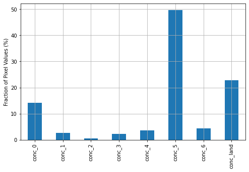
With these definitions, the pixel-wise distribution of classes across all 3,392 images in the dataset was calculated. There is a strong class imbalance, with open water, 90-100% ice, and land occupying most of the dataset.
 |
|---|
| Pixel-wise class distribution over all images |
2.2 Data Input Pipeline
Before being fed into the model for training, the following operations were performed on the dataset:
- Image/mask pairs were split into training (80%) and validation (20%) sets
- The split was stratified based the most common class represented in the images
- Within the training data, images with high amounts of under-represented pixels were over-sampled (eg. duplicated in the training set to increase their weight)
- This helped address the class imbalance in the dataset that would skew a model towards the over-represented classes
- Random image augmentation:
- Random flip left-right
- Random flip up-down
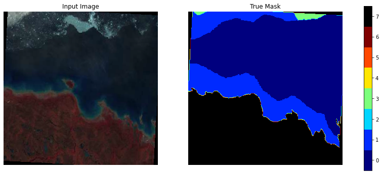
- Random image rotation by +- 5 degrees (corners we mapped to black in the image and land in the mask)
The result is a stream of image/mask pairs like this:
 |
|---|
| Sample image/mask pair training data. Note the random image rotation. |
3 Model Building
The goal of the model was to automatically generate a sea ice chart based on a satellite image. This is an image segmentation problem, wherein a model is expected to predict a class for each pixel in an image.
3.1 U-Net
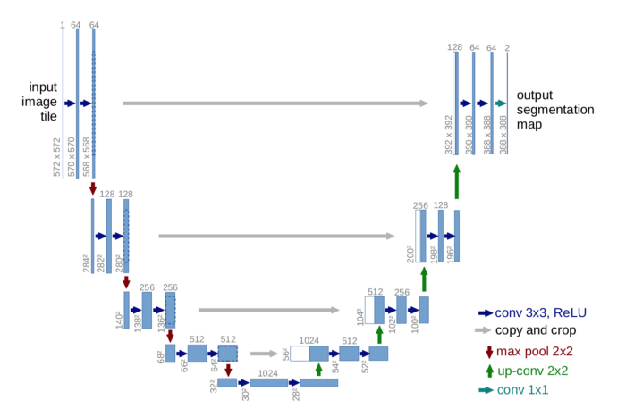
A popular convolutional neural network architecture for image segmentation is the ‘U-Net’. It consists of a contraction path (composed of successive convolution, ReLU activation, and max pooling operations) followed by an expansion path. In the expansion path, a combination of up-sampling and concatenation with high resolution images from the contraction path allows the network to localize features of the image at higher and higher resolution until each pixel of the image has a predicted class. A diagram of the basic architecture of the network is shown below.
 |
|---|
| Base U-Net Architecture. Source: https://arxiv.org/pdf/1505.04597.pdf |
3.2 Model Definition
The model for this project is an adapted version of a U-NET from the Dstl Satellite Imagery Feature Detection Kaggle competition. That competition also aimed to classify pixels in satellite images, so this model architecture was expected to be good fit here too. See here for the original model writeup. The base model architecture was supplemented with dropout layers to help with over-fitting. A diagram of the final model architecture is shown below.

3.3 Training and Predictions
The neural network above was trained for 100 epochs (where an epoch is a run through the entire training dataset). Plots of training/validation loss and mean IoU metric are shown below. IoU is also known as the Jaccard index.
 |
|---|
| Model performance over training epochs |
The lowest validation data loss is achieved after roughly 50 epochs, after which the model begins to over-train. The model weights at this ‘optimal’ point were saved and used for the final model. A confusion matrix with these weights is below. The model is very good at predicting open water and land, and somewhat poorer at predicting the intermediate ice concentrations (10-90%). This could almost certainly be improved by collecting more images with these intermediate ice concentrations, which would be best achieved by focusing data collection on the springtime/early summer months when the ice is thawing.
 |
|---|
| Final model confusion matrix for validation data |
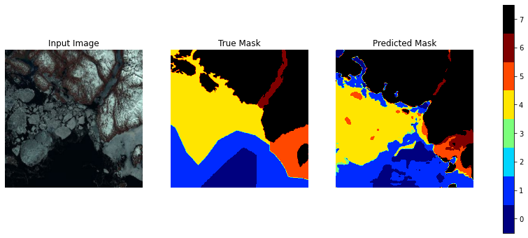
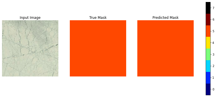
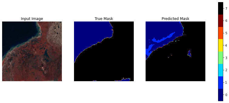
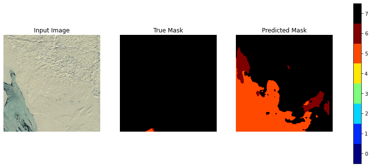
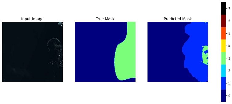
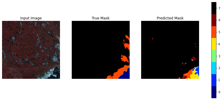
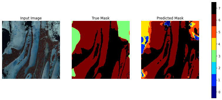
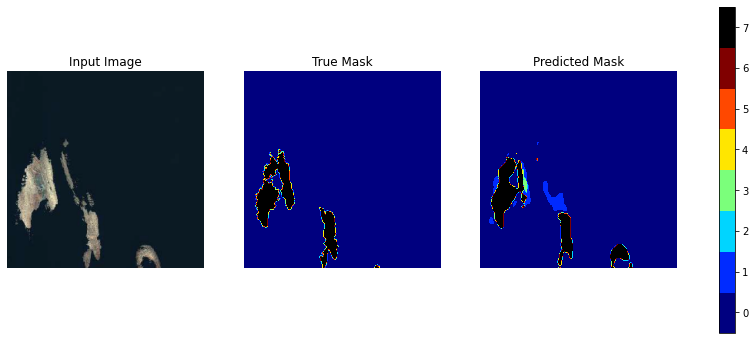
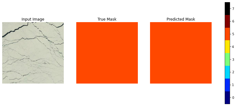
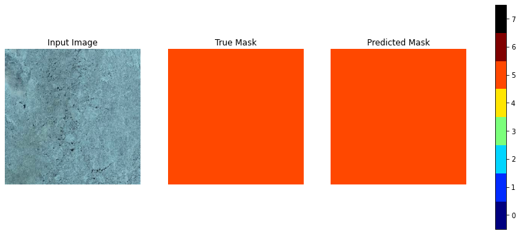
A series of validation data images, true masks, and predicted masks are shown below. The class imbalance of the dataset is apparent here, with land and solid ice dominating many of the images. Nevertheless the model is able to provide a good prediction of localized ice concentration in many cases. It is also interesting to note that the model provides finer detail than the published ice charts. With additional training data, perhaps algorith such as this could be used to develop finer-detailed ice charts than are curently available.
The class definitions from section 2.1 are repeated here for reference:
- 7: land
- 6: fast ice (thick ice that is ‘fastened’ to the coastline)
- 5: 90-100% ice
- 4: 70-90% ice
- 3: 50-70% ice
- 2: 30-50% ice
- 1: 10-30% ice
- 0: <10% ice
